Infendo – Nintendo news, reviews, podcast, Wii, DS, and retro video game blog RSS feed.

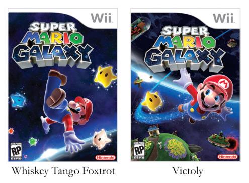
New Mario Galaxy box art is more coordinated

Wednesday, September 5th, 2007 at 3:47am by Boss Hog

smgart661.jpg

[Via Wired; Thanks, Seth!]

11 Comments

  1. John says...

    That’s a lot better. I wasn’t diggin how part of the main focus was on Mario’s ass, and overall the older version wasn’t substantial enough. The logo was doing crazy things being pushed over to the left. The new one seems moreappropriate and Mario-classic-esque.

  2. Rushli0n says...

    No problem guys. Just searching for the TRUTH!

  3. David says...

    That’s definitely the new box art .. Nintendo’s Press Site confirms it.

    As for the new art vs old .. the one on the left is interesting, but it works better as a magazine cover than box art (see the most recent Nintendo Power).

  4. Kevin says...

    The new one is good and all, but what’s with the phallic in the upper left hand corner?

    Official Slogan?:
    “Super Mario Galaxy: It’ll give you wood”

  5. KillerHeroes says...

    Much better.

  6. Kale says...

    Misinterpreted sexual innuendos aside, I’m getting more and more stoked for this game. That new cover is definitely professional caliber now, the only question is, though, will I be able to pull myself away from Metroid long enough to play Galaxy? And what about Geometry Wars? What about Phoenix Wright? What about Ninja Gaiden? What about Phantom Hourglass? What the hell am I supposed to do when Brawl comes out? I still have to work for a living you know……I love Nintendo.

  7. InvisibleMan says...

    I know, this thing is getting out of control, especially for the DS… Worms Open Warfare 2 is coming out today! And I’m not even past the first levels in Luminous Arc or Picross DS!

  8. Liraco says...

    I like the new cover art and definitely look forward to the game.

    Whiskey Tango Foxtrot on the original art indeed…

  9. Abras says...

    Much better! Is anyone else reminded of the Mario 64 box art?
    But I will agree that the top left corner is a little disturbing

  10. gojiguy says...

    Yeah the new one is less Mario-swimsuit-moneyshot and more Mario-64-reference. I like.

  11. Eric says...

    Some comments from the original article on Wired…

    “And yet in the new box art, it appears that he is propelled through space by milky white explosive diarrhea.”

    “And here I thought featuring his ass was part of Nintendo’s ‘mature Mario’ movement. Maybe they’ll give him a big gun and a smooth sports car instead.”

    “Ah, brilliant. Or rather, not brilliant. All your base are belong to us.”

    I love the odd crowd of people who post on the Wired comments. :P

Post a comment


COMMENT RULES: Infendo welcomes thoughtful and critical comments. But if you're rude, off-topic, or vulgar, we'll delete your stuff. Have fun and thanks for adding to the conversation.
Want speed commenting? Login or register for free to become a member.